
Disney Plus Redesign
This is case study is aimed at improving the user experience of the Disney pPlus home page. Having never used the service I set out to understand the relationship between the product and consumers.
The Proccess
Step 1 – Take a walk
I needed to take some time to think about how to approach this design challenge, especially without any direction. It’s intimidating stupid to think that I could out-do the entire design team at Disney. After a nice 30 min walk I was able to come up with a plan of action.
Step 2 – Become a user
This one was obvious. Being a first time user I was not yet accustom or blind to the subtle inconveniences of the product, I had the upper hand of “fresh eyes”. My initial impressions was thought was that it looked good but lacked empathy. Obviously they can’t understand me on initial sign up right?! Wrong! Humans are all different but we are often the same in a lot of ways too, let’s design for that human trait! But how? There were a few interaction fails around the functionality of the carousels that just needed to be fixed too.
Step 3 – Talk to People
It’s alway dangerous to design anything based on assumptions. We often get wrapped up in a world of our own ideas and look for validation of our new ideas instead of listening and letting people give us the ideas, that we can develop more. I interviewed 10 Disney plus users and asked these questions.
Why did you start using disney plus?
First show?
You got kids? What ages?
How do you decide what to watch?
How many shows do you watch concurrently?
How often do you deviate from a channel?
Have you ever been surprised about content?
How often do you rewatch shows or movies after completed?
Do you often search or just explore?
What device do you usually watch on?
Do you talk with your friends about the shows?
Anything that annoys you?
Step 4 – Making Sense of it all
I had to ingest the responses and found that just based on 10 interviews I was able to create 3 personas; people with out kids, people with very young children, and families with older children. Patterns emerged that presented unmet needs.
Step 5 – The Concept
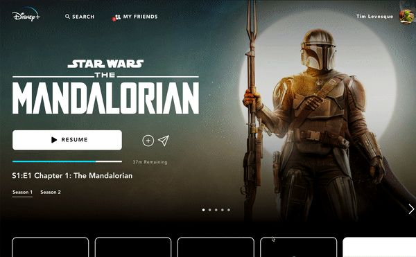
There were a few universal needs that were some easy low hanging fruit. Social Sharing, channels that matter to you instead of the out of the box 5, and elimination of content that you just have no interest in. I decided to focus on 4 major features.
- Returning to watch the same show.
- Recommendations from friends
- Channels that people actually liked.
- watchlist for people with small children.
The content would be powered and informed by initially profiling the customer to present and populate the critical areas on initial sign up.
Step 6 – The Design
After basic pencil sketches were completed we took it into Figma and started designing. The goal was not to make it look totally different, as that can scare off existing users. The goal was to fill needs in a subtle way that would not drastically change the look while fixing a few interaction design fails.